Kendall made us stand up and shake out the sleep but it seemed to work. Let’s do this. Last session of the day! Starting up with Ryan Jones.
Make data actionable! Three “WHATS”
- What is it? Reporting!
- What does it mean? Analysis!
- What should we do about it? Actionable!
You don’t have to start with the first one, you can start from the end.
Ryan uses the “strategy” of getting the hell out of Detroit (he’s from there but he loves it!), how do yu do it? The “tactics” are a boat/bridge/tunnel/plane, etc. Are you measuring the tactic or the strategy? You really have to think about it.
So our point of view changes what we see, as we are watching some of his funny slides. That raw data can mean different things and change. Let’s make sure the story comes through.
So he is boring us all and he’s going to get actionable.
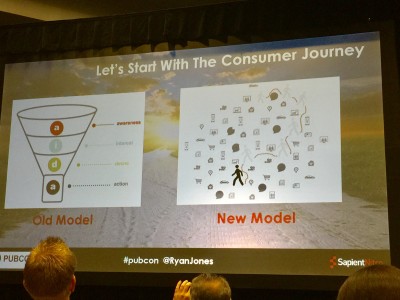
Most of us have heard of the funnel. It’s a boring funnel (unless it’s a funnel in Vegas) and Ryan says it doesn’t look like a regular funnel! There are too many touch points.
Ryan’s favorite tool is linkscapes. It’s a graph of all the links and pages. How do they relate to each other? The graph shows a bunch of page issues that you might not have seen before. It’s great to do on an epic scale. You can also use it for internal links.
He loves Google Fusion Tables which is free. There is a little manipulation to it but you can see the canonical issues and dup homepages. He also uses Gephi, really recommends it.
Ryan moves into Keyword Research. A long list of excel keywords totally sucks. Instead, turn that spreadsheet into an opportunity map. It’s the same data but it’s all boxed up. There are three different ways to do it, Ryan uses an internal tool. Google Sheets is one tool and another tool is called Raw. With the box is how many searches it gets a month in Google. The big box means more searches, the colors (dark or light) means if you can rank easily on it or not. Ryan gives it to clients and tells them to work on the keywords with the big box.
But let’s not stop there, social media can be layered in too.
Let’s throw some old school venn diagrams with using fusion tables from Google.
Alchemy API is one of Ryan’s favorite data sources. It brings sentiment in which is helpful. Run your site through it to figure out what your site is about.
He has a custom SEO dashboard and requests no photos! But it’s super cool and in progress at the company. It pulls from a whole bunch of places from APIs and is doing cool stuff. Since we can’t do this, he recommends Cyfe which gives out 5 free widgets and then you can buy more. It’s easy to create charts.
Google Data Studio is another cool one but it doesn’t support a few things… but hopefully they will add it.
A few more tools… He hired Laurent who made all those tools. Ryan loves him. So what can we use?
Raw.DensityDesign.org and it’s open source! Paste your data in and select your chart. Super cool tree maps? Done.
- SEMRush
- Moz Open SIte
- Majestic
- A Hrefs
- Google Webmaster Console
- Screaming Frog
- Code! (d3.js is amazing)
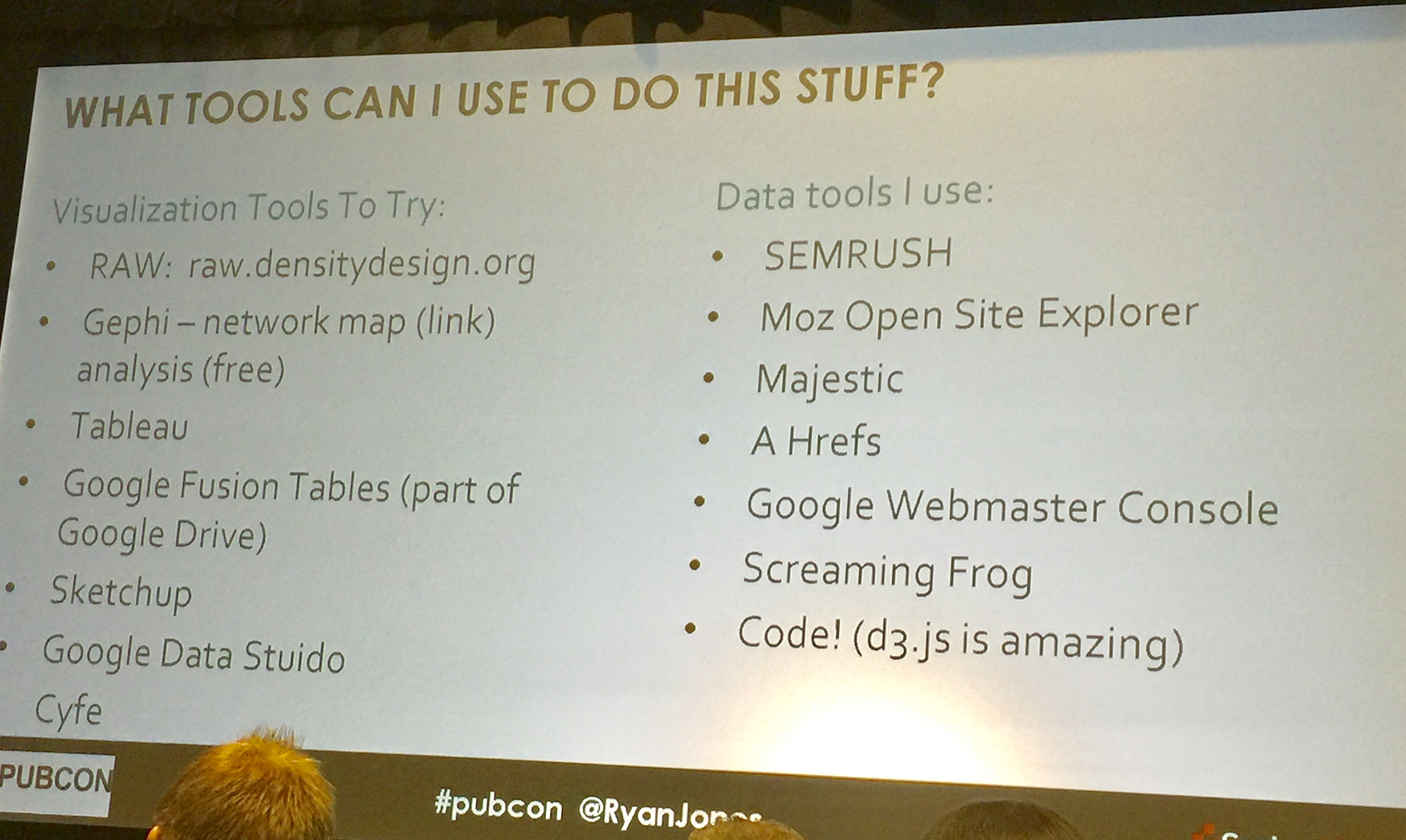
You can use the tools but it’s what you DO with the tools. Use those visualization tools mentioned above like Raw, Gephi, Tableau (expensive!), Google Fusion Tables, Sketchup, Google Data Studio, and Cyfe.
Nice! Ryan’s out.
Erin is up and she’s warning us about her salty language. I’m ready for it.
Data is only useful as its ability to find or tell a story. These patterns, trends, and correlations can help us figure it out.
Some common mistakes that happen with visualization
- Not taking the audience into account!
- Not understanding how much your audience knows about something.
- Inconsistent placement of labels and legends
- Isolating data (get the whole story!)
What is the best visual? Stop using pie charts for everything! Which way is the best? It can depend. Erin really likes a data type chart which will help you figure out what graph to tell the story. She broke them out in her slide share deck.
In talking about bar chats, there are so many of them. People will choose the same one. Do you know which chart to choose? If something doesn’t use a timeline, horizontal might work, for instance.
With pie charts, people only perceive the big pieces when the smaller ones are harder to understand.
Don’t just blindly choose a visualization, really think about what you are actually looking to share.
Erin is flying through these and you can check out her slide share if you are interested. I know I would love to look at it later!
Heat maps are awesome for search because you can pay attention to the usage of specific keywords across various geographies that can give you a leg up over the competition.
Make your data less crappy! There are three ways to do it. I’d list them but she’s already flown past! Alphabetically was the first one. 🙂
Use consistent iconography, symbols, and fonts. It’s just distracting if you use too many. Also use color sparingly AND complimentary. Match the colors to your subject AND tone. Erin thinks 3D charts are rarely necessary.
Message, medium, and method
If you have three campaign messages, how do you figure out what channel you want to put them through? Take your message and figure out the content (video/ads) and where you shared them (YouTube/FB) so you have your message, medium, and method. You can figure it out what type of conversation style is working for each thing. What message is performing better?
The fourth “M” is market. Take that data and understand how different cities and regions respond to various messages, campaigns, or marketing channels by overlaying it into a heat map.
Erin’s done!
Q – How was Elton John? (Erin went last night)
A – Amazing!
Q – Mobile first indexing? Anyone worried or any questions?
A -Top three insights from Ryan, if you have content that is only available on the desktop, you might suffer. Other than that, not much to worry about. Honestly, when Gary said it, Ryan was shocked. Erin says the phones keep getting bigger and bigger, the desktop might look more like mobile anyway.
And that’s it for Vegas PubCon 2016.

Comments on this entry are closed.